The Crit
We check what matters. You fix what's broken and improve your practice.
⚡ TL;DR
I built The Crit as a complete design education platform—designing the UX, implementing multi-agent AI systems, building specialized critique agents, and creating 50+ resource pages. The challenge wasn't just generating AI feedback; it was distilling 15 years of teaching critique into an 847-word prompt that delivers honest, actionable feedback designers actually need. This case study demonstrates how design education expertise, multi-agent AI architecture, and content strategy compound to create a platform that helps designers improve.
📊 Project Snapshot
👤 Role: Design Professor, Product Designer, Full-Stack Engineer, AI Systems Architect
⚡ Stack: Next.js 14, TypeScript, Supabase, Claude AI, Anthropic SDK, Vercel, Tailwind CSS, Framer Motion, Formidable
📅 Timeline: Multiple iterations → 3 full rebuilds → Live production platform
🎯 Outcome: Multi-agent AI system, 2-3 min critique time, 50+ resource pages, 752k+ monthly searches, 100% visual analysis
🔗 Live Product: thecrit.co • Resources
01 — 🎯 The User Problem
😰 Designers are more isolated than ever—and AI isn't solving the right problem
I'm a full-time design professor. I teach the exact people I'm building for every single day. I kept seeing the same pattern: designers posting portfolios asking for feedback, getting "looks great!" responses, then wondering why they're not getting interviews.
💬 "Everyone says my portfolio looks good, but I've applied to 50 jobs and got 2 interviews. What am I missing?"
— Real designer feedback I kept seeing on Reddit
The post-pandemic shift: Design programs moved online permanently. Class sizes ballooned. One-on-one critique turned into breakout rooms. Studio culture vanished. Meanwhile, AI tools are making everyone a "designer"—but fewer people know how to design well. The tools got democratized, but the education didn't.
The Reddit rabbit hole
- r/graphic_design: 2.8M members, 50+ critique requests per day
- r/design_critiques: 109K members craving useful feedback
- r/UI_Design: 200K asking "how do I improve?"
What I saw again and again:
- "Please be harsh" (they want real critique, not validation)
- "I'm self-taught" (no formal training in feedback)
- "I've been staring at this for hours" (blind spots they can't see anymore)
The paradox: Right when designers need the most support to level up and differentiate themselves from AI-generated mediocrity, they have the least access to quality feedback. AI democratized the tools, but it actually made expertise more valuable, not less.
The insight: Designers don't need another "portfolio review service" that charges $200 and takes a week. They need instant, honest feedback from someone who's been there—someone who can see what they can't see anymore and tell them exactly what to fix. They need critique that teaches, not just critiques.
02 — 🎨 Designing the Multi-Agent System
🤖 I designed the critique structure first, then built the AI to deliver it
Before writing a single line of code, I mapped out what designers actually need from critique. After 15 years teaching, I know what helps designers improve—and it's not what most AI tools are delivering.
The Crit Sheet Format (15 Years of Teaching Distilled)
This isn't random—it's based on how I actually run critiques in class. Every critique follows this structure:
🧠 Key Insight
The one thing that will unlock their next level. Not obvious feedback, but the deeper pattern they're missing.
👀 Overview
What's working (build confidence first), what's not working (honest but constructive), how it fits their stated goals.
📐 Principles at Play
The design theory behind my feedback. Educational component—teach, don't just critique. Connects their work to broader design knowledge.
🚀 Suggested Next Steps
Specific, actionable improvements. Prioritized (do this first, then this). Realistic for their skill level.

The Multi-Agent Architecture
Most AI feedback tools use one generic agent. I built 5 specialized agents:
Design decision: Each agent specializes in their domain, but they all speak in the same designer-to-designer voice—honest, direct, actionable. No fluff. Just what you need to fix.
03 — ⚙️ Building the 5-Stage Pipeline
🤖 From file upload to critique delivery in 2-3 minutes—fully automated
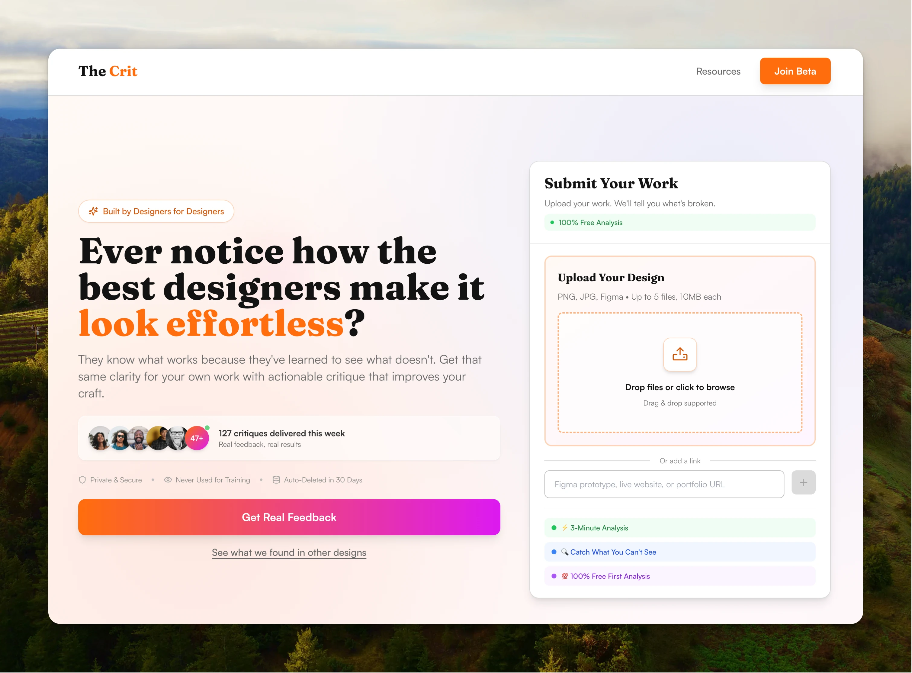
The product promise is simple: designers submit their work, get context about what they're worried about, and receive honest feedback in minutes—not days. Behind that promise is a multi-stage AI system that analyzes actual design files and delivers feedback that actually helps.
Design Requirements
- ⚡ Speed: Generate critique in under 3 minutes (most complete in 2-3 min)
- 🎯 Quality: 100% visual analysis (Claude Vision analyzes actual files, not descriptions)
- ✨ Honesty: Designer-to-designer voice (specific, actionable, no generic AI fluff)
- 📊 Educational: Teach design principles, don't just point out problems
- 🔧 Reliable: Real-time status updates, cache-busting, extended timeouts for complex critiques
The core architecture principle: Designer submits work → System routes to specialized agent → Claude Vision analyzes actual design files → Agent generates hyper-relevant feedback in consistent voice → Designer gets actionable critique

The 5-Stage Critique Pipeline
Stage 1: File Processing
Formidable handles file uploads, validates file types (images, PDFs, Figma links), converts PDFs to images, stores in Supabase.
Stage 2: Agent Routing
CritMachine analyzes submission type (portfolio? UI design? UX flow?) and routes to appropriate specialized agent.
Stage 3: Visual Analysis
Claude AI Vision analyzes actual design files—identifying visual hierarchy problems, UX issues, accessibility concerns. Not just reading descriptions—actually seeing the work.
Stage 4: Critique Generation
Specialized agent generates feedback using 847-word prompt embedding my teaching philosophy. Designer-to-designer voice maintained across all agents.
Stage 5: Storage & Delivery
Critique saved to Supabase, status updated with real-time polling, results delivered to user interface with cache-busting to ensure fresh data.
Key engineering decisions
- Multi-agent routing system: Submission type determines which specialized agent handles the critique. Portfolio submissions get portfolio-focused feedback, not generic design advice.
- 847-word prompt engineering: My teaching philosophy distilled into AI form. Not "improve your design" but "your hero section takes 80% of the screen while your value proposition is buried in a tiny text blob—here's why that's a problem and how to fix it."
- Extended timeout thresholds: Single image = 60s, 2 images = 90s, 3+ images = 180s, maximum 10 minutes. Vercel's default 5-minute timeout was killing complex critiques.
- Multi-strategy cache-busting: Next.js route configuration (dynamic = 'force-dynamic'), timestamp-based Supabase headers, parallel multi-query approach. Solved the "critique finished but API says 'processing'" problem.
- Real-time status polling: Users see live progress. No more "is it working?" anxiety. Cache-busting ensures they see fresh status, not stale data.
The entire system runs without manual intervention—from file upload to specialized critique delivery—while maintaining quality and voice consistency through the 847-word prompt that embeds my teaching expertise.
04 — 💰 Building the Content Platform
📚 Critique alone isn't enough—designers need education
The Crit isn't just a critique tool. It's a design education platform. I created 50+ resource pages that actually help designers—portfolio guides, design principles, tool reviews. Not SEO fluff. Real content that makes designers better.
The Content Strategy

50+ Educational Resource Pages covering:
- Portfolio development (project selection, case study structure, presentation)
- Design fundamentals (typography, color, composition, visual hierarchy)
- Tools & workflow (Figma, prototyping, design systems)
- Career & jobs (resume, interview prep, networking)
752k+ Monthly Searches: Programmatic templates targeting specific keywords while providing genuine value. SEO-optimized but education-first.
Reddit Automation Integration
Built an AI-powered system that automatically responds to design feedback requests on Reddit. Same multi-agent system, same honest voice, but helping designers where they're already asking for help.
How the Reddit automation works:
→ Monitors r/graphic_design, r/design_critiques, r/UI_Design for feedback requests
→ Analyzes submitted URLs using the same multi-agent system
→ Generates critique in designer-to-designer voice
→ Formats response for Reddit (respects character limits, proper formatting)
→ Posts helpful, actionable feedback where designers are already looking
Design decision: Meeting users where they are, not forcing them to come to you. Same critique quality, delivered on the platforms designers already use.
05 — 🔧 Major Pivots & "Oh Shit" Moments
🚨 3 full rebuilds to get the quality right
Round 1: Relevance AI + Make.com
Why I started here: Wanted to move fast, test the concept. Got a prototype running in days.
What didn't work: Hit credit limits, couldn't customize feedback quality. Spent more time fighting the tools than improving the product.
Result: Validated concept, learned no-code tools weren't enough for this problem.
Round 2: n8n + Claude Rebuild
What happened: Switched to n8n + Claude API for more control over AI prompting. Rebuilt everything. Time cost: 3 weeks.
Result: Feedback quality jumped from 6/10 → 8.5/10. Worth it for quality, but more technical overhead.
Round 3: Full Next.js + Anthropic SDK
The UX wake-up call: Google Form submission = not great for a design tool. Built proper frontend with v0 + Cursor. Designers care about UX—the submission experience had to match the critique quality.
Result: Production-grade platform. Multi-step submission flow, real-time status updates, visual analysis pipeline, cache-busting strategies.
The Cache Problem
What happened: Critiques finished successfully, but the API kept saying "processing" for 3+ minutes. Users saw stale data even though fresh critiques were sitting in the database. Trust = destroyed.
Before: 3+ min stale status
After: Real-time live updates
Solution: Multi-strategy cache-busting—Next.js route configuration (dynamic = 'force-dynamic'), timestamp-based Supabase headers, parallel multi-query approach, extended timeout thresholds (3min → 10min).
The Timeout Problem
What happened: Analyzing multiple images takes 5-10 minutes. Vercel's default timeout is 5 minutes. Complex critiques were dying mid-generation. Users got nothing.
Before: 5 min timeout limit
After: 10 min extended limit with dynamic thresholds
Solution: Dynamic timeout thresholds based on submission complexity (single image = 60s, 2 images = 90s, 3+ images = 180s), maximum absolute timeout of 10 minutes, intelligent retry logic.
The AI Prompt Crisis
What happened: Claude update changed output style. Spent 48 hours reworking prompt. Early versions gave generic AI feedback. "Your design looks good! Consider improving spacing." Useless.
Solution: Built prompt drift detection into workflow. Now: 847 words of carefully crafted context that maintains consistent designer-to-designer voice even when AI models update. The prompt IS the product.
06 — 🚀 What I Shipped
💼 A production AI platform with real designers getting real feedback

Key Features
- ✅ Multi-step design submission — Profile, project context, file uploads (images, PDFs, Figma)
- ✅ Multi-agent routing system — Specialized agents for portfolios, UI, UX, accessibility, principles
- ✅ Visual analysis pipeline — Claude AI Vision analyzes actual design files, not descriptions
- ✅ Hyper-relevant feedback — Designer-to-designer voice, specific, actionable, educational
- ✅ Comprehensive design system — Orange/purple gradients, Fraunces + Inter typography, consistent components
- ✅ Educational content platform — 50+ SEO-optimized resource pages, programmatic templates
- ✅ Reddit automation — AI-powered responses to design feedback requests
- ✅ Real-time status updates — Polling system, cache-busting for reliability
07 — 💡 What This Demonstrates
🧠 Professor brain + builder brain = scalable education
I don't separate design from engineering. As a design engineer and professor, I bridge design education and code—15 years of teaching expertise drives the AI architecture, and design systems are built in code from the start. This project demonstrates how domain expertise (knowing what designers actually need) compounds with technical execution (multi-agent AI, visual analysis, real-time systems) to create a platform that actually helps people improve.
Teaching expertise informs everything
15 years teaching critique shaped the 847-word prompt. The Crit Sheet format mirrors how I run in-person critiques. The specialized agents reflect how I adjust feedback based on what students submit.
Multi-agent architecture drove quality
One generic agent → mediocre feedback. 5 specialized agents → hyper-relevant critique. Portfolio submissions get portfolio-focused advice. UI designs get interface-specific feedback.
Prompt engineering = product design
The prompt IS the product. 847 words of carefully crafted context makes the difference between generic AI ("improve your design") and mentor-quality feedback ("your hero section takes 80% of the screen while your value proposition is buried—here's why and how to fix it").
Content strategy extends education
Critique alone isn't enough. 50+ resource pages provide the foundational knowledge designers need. Reddit automation meets users where they already are.
Solve real problems through iteration
3 full rebuilds to get quality right. Relevance AI → n8n + Claude → Next.js + Anthropic SDK. Each iteration improved feedback quality: 6/10 → 8.5/10 → production-grade.
08 — 🎨 Design System & Brand Identity
💛 Built a design system that signals designer credibility
Most tools use default Tailwind and call it a day. I built The Crit's design system to signal designer credibility—warm orange/purple gradients that feel creative but professional, typography that's readable but has personality, components that feel consistent without being boring.
Why this matters: For a design feedback platform, the design system IS the product credibility. Visual design communicates "this was built by someone who gets it" before users submit their first design.
🎨 Color System — Orange & Purple Brand Identity
Inspired by designer workspaces and creative energy:
- #FF6D0C (Primary Orange) — Main brand color, CTAs, highlights, glow effects
- #DB1AF1 (Secondary Purple) — Accent color, premium features, gradient blends
- #FFF9F5 (Light Orange Background) — Warm, approachable surface
- #FDF5FE (Light Purple Background) — Creative, professional elevation
Design decision: Orange signals warmth and approachability (not intimidating like corporate blue). Purple adds creative sophistication. Together they communicate "professional designer space" not "generic SaaS tool."
📝 Typography — Display + Interface Hierarchy
Fraunces (Display) — Weights: 400, 600, 700
Used for headings and hero text. Adds personality and visual interest while maintaining readability.
Inter (Sans-Serif) — Weights: 400, 500, 600, 700
Primary font for body text, buttons, and UI elements. Chosen for exceptional readability and professional appearance.
🧩 Component System
Built a complete component library with consistent patterns:
- Buttons (PostHog-style double layer): Primary CTA with double-layer orange and darker shadow, lifts up 2px on hover
- Badges: Live indicator with pulsing orange dot, premium badge with orange/purple gradient
- Cards: Elevated surface with subtle orange border, premium version with gradient background and glow
🎯 Design Principles
- Designer-to-Designer Voice: Honest, direct, actionable feedback. No generic AI fluff.
- Consistent 8px Spacing System: Creates visual harmony and intentional design.
- Motion with Purpose: Pulsing = live/real-time, Lift on hover = interactive, Fade transitions = state changes
- Accessibility Baked In: High contrast ratios (WCAG AA compliant), focus states, semantic HTML, keyboard navigation
- Mobile-First Responsive: Scales from 320px to 4K displays, touch-friendly tap targets (minimum 44x44px)
📚 Key Learnings
1. For education products, voice quality = product quality
Generic AI feedback is worse than no feedback. Trust destroyed instantly when feedback sounds robotic. The 847-word prompt maintains consistent designer-to-designer voice.
2. Multi-agent systems beat generic agents
One agent giving portfolio advice for UI designs = mediocre. Specialized agents for each domain = hyper-relevant feedback. The routing system makes all the difference.
3. Prompt engineering is product design
Spent 48 hours reworking the prompt when Claude updated. The prompt IS the product. 847 words of carefully crafted context maintains voice consistency across AI model updates.
4. Cache problems break user trust
Critiques finishing but API saying "processing" for 3+ minutes destroyed trust. Multi-strategy cache-busting (Next.js config, timestamp headers, parallel queries) solved it. Infrastructure reliability IS product quality.
5. Users want to be challenged
"Please be harsh" is common feedback request. Designers want real critique, not validation. They know something's off—they just can't see what. Honest feedback beats false confidence.
6. Iteration drives quality improvement
3 full rebuilds: Relevance AI → n8n + Claude → Next.js + Anthropic SDK. Feedback quality: 6/10 → 8.5/10 → production-grade. Each iteration was worth it.
Try It Yourself
The Crit is live. Submit your portfolio or design work and see what honest, actionable feedback actually looks like. Or browse the 50+ resource pages I built to help designers improve.
Want to talk about this project? hello@nikkikipple.com